Wedding design is one of the many aspects of planning that can go from exciting to daunting reaaaal quick. What starts out as fun Pinning swiftly switches over to: “How do I make all of this happen on my budget?” And it does not have to be that way! Lucky for you, we have some quick tips on how to conquer Pinterest and make your design dreams a reality.
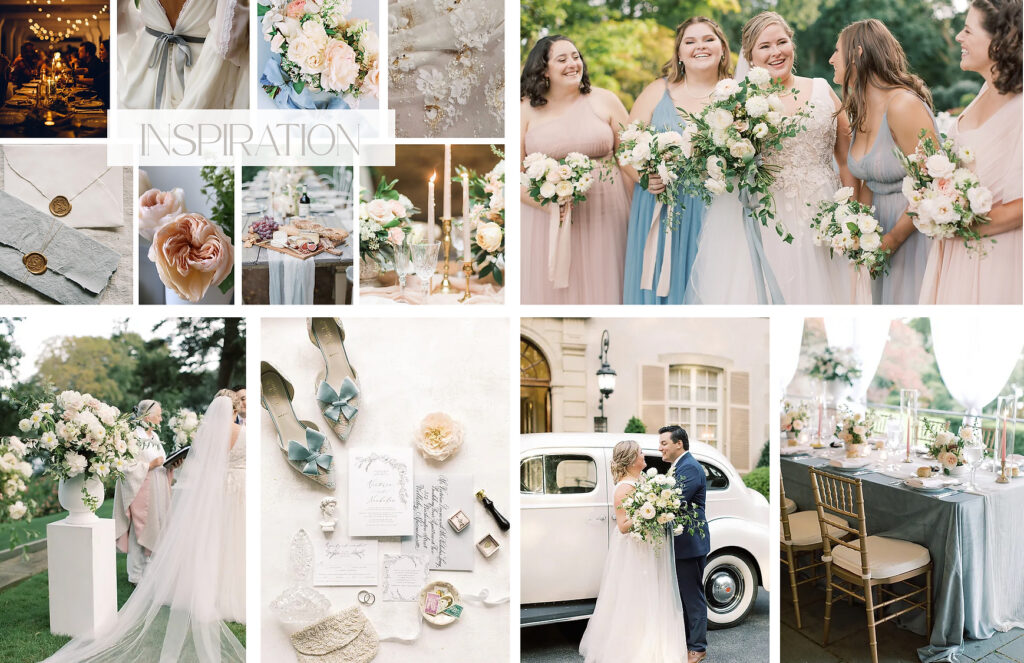
Make Pinterest Your Friend… Not Your Enemy!
Pinterest can be an amazing source of inspiration. But, it should stay just that: inspiration. From there, taking that inspiration and identifying the right local professionals who can deliver a variation on those ideas, produce the mood and feeling you’re desiring, and stay within the budget – is the ultimate goal. The design process will be a whole lot more interesting, personal and fun for everyone if you focus on descriptive words that evoke feeling and imagery, rather than trying to replicate something you saw on Pinterest or Instagram.
When I put together design proposals, I tell couples to not get too attached to the exact images in the mood board and inspiration photos. I try and mix in some non-wedding images as well, to really get at the heart and soul of the design as opposed to a collection of photos that represent someone else’s vision. After all, I want your design to be yours, not someone else’s.
Another BIG reason to keep Pinterest and Instagram at an arm’s length is because I’ve often seen clients get attached to images from styled shoots or other weddings and events that are out of their budget. Most clients are shocked when the price tag for many of those images is revealed. When this happens, no matter what your florist or designer or rental company suggests as an alternative, you’re likely to be disappointed.
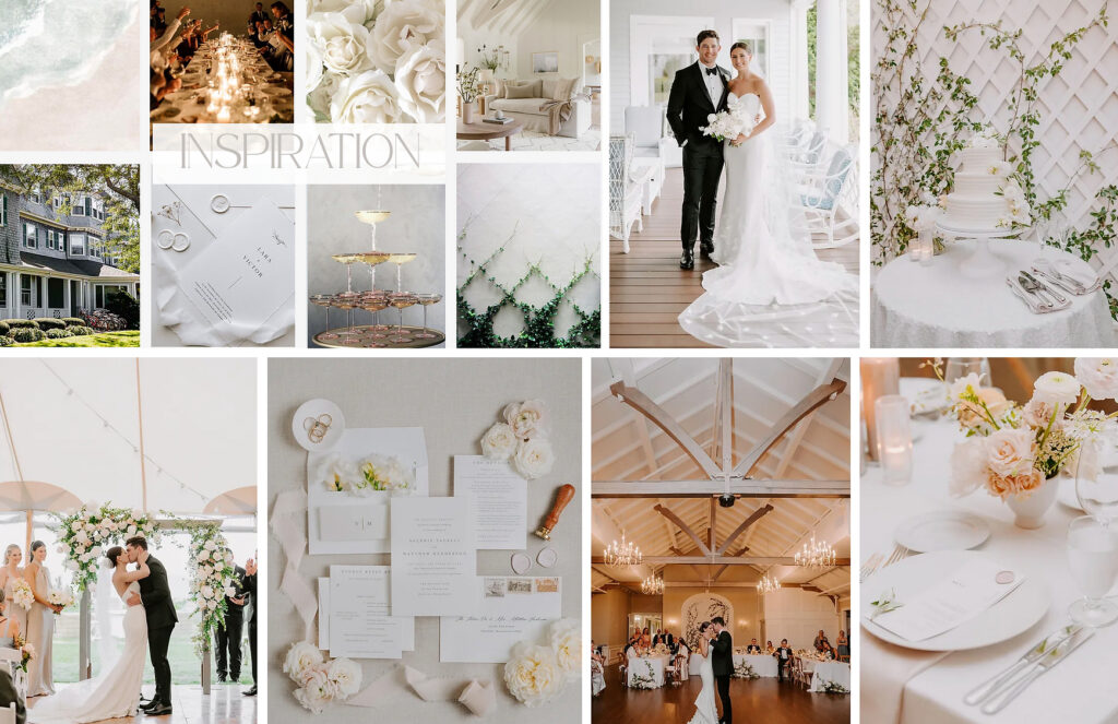
The four step process to making Pinterest your BFF:
1 – Early on, get all the pinning out of your system. Pin everything to your hearts desire. Dream big. Look at aaallllll the images and get a feel for what you’re drawn to.
2 – Take a step back and notice if there are any trends to what you’re pinning. Determine the three words that describe the way you want your wedding or event to feel. Urban, rustic, comfortable, upscale, vibrant, muted, modern, warm, minimalist, glamorous… any adjective is up for grabs! But you can only choose a max of three. Make sure that you involve your fiance in this so that these words feels connected to you both as a couple.
3 – Make a second board and pin NO MORE than 10-15 images that all tie back to your three words. If they don’t represent the feeling of one of your three words, don’t pin. And, don’t be afraid to pin NON-wedding photos. Yes! Your personality exists in so many places outside of your wedding design. Your home, your lifestyle, the clothes you wear, your hobbies. This is the start of how we make a design unique and make it yours.
4 – Then, delete the other Pinterest board and stop pinning. YES. Say goodbye to the other ideas. You’ll never feel satisfied with your design concepts if you feel like there are always more pins and more ideas out there to explore. It will hold you back from moving forward, not to mention challenge your sanity and take away from the joy of the design process.
From that point forward, this Pinterest board will be your North Star for design. When you feel lost or confused about decision making, refer back to it to keep yourself on track with your vision.
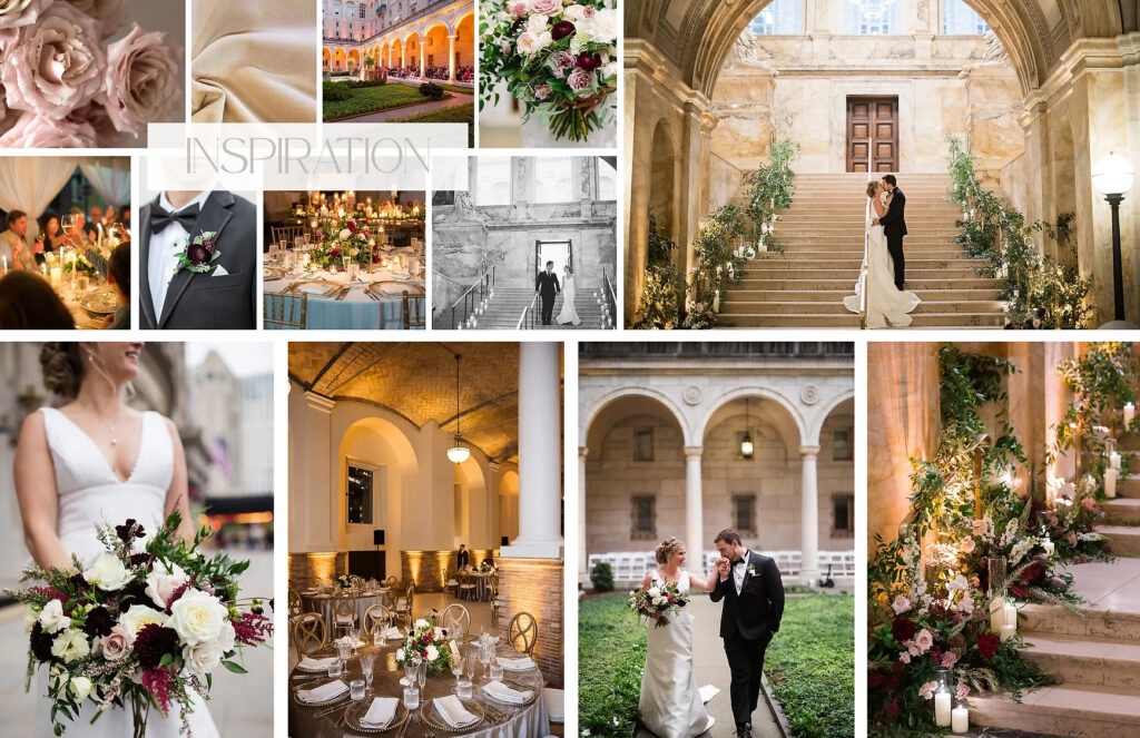
Don’t Spread Your Budget Too Thin…
Once you’ve landed on some key images and descriptors for the look and feel, you can really start to think about opportunities for your “wow” moments and begin to prioritize your design funds. I am of the mindset that a $10,000 decor budget is better spent in fewer, high-impact places than stretched thin over every single area of your reception. Not to say you should ignore all the little details (more about that below!), but you don’t necessarily have to upgrade and splurge on every detail. Having some understated moments will help make the high impact moments really stand out.
Have you been dreaming of big, lush bridal bouquets? Falling in love with farm tables or a really unique chair? Amazing lighting to take your dance party to the next level? Take 2-3 of those “must have” visuals and price them out. See what sacrifices you would need to make in other areas to be able to afford that WOW moment. Perhaps you can utilize the venue’s house linen, china, and glassware in order to afford some amazing chandeliers or lots of bistro lighting (if you don’t know yet how much I heart lighting, you’re about to find out).
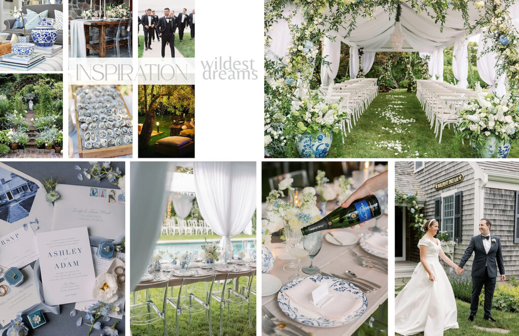
Some of our favorite ways to implement “wow” moments:
Frame Your Ceremony
You are going to have SO many photos of you and your fiance at the end of the aisle together. Give yourself the backdrop that that moment deserves. To make the most of your money, while venue scouting, consider natural backdrops that already exist at the venue for your ceremony. If a little oomph is needed, work with your florists to brainstorm ways to frame the space. And, ceremony florals can be moved during cocktail hour to create another wow moment inside your reception space.
Lighting, Lighting, Lighting
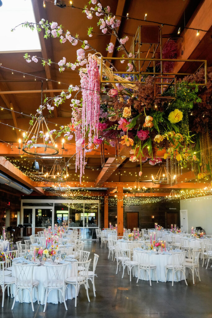
The power of lighting is SO under valued for many first time party hosts. SO much of a room’s ambiance is created with amazing lighting. See if your venue comes with any lighting upgrades, and if not, ask for a referral to some local lighting vendors. A an investment in specialty lighting can completely transform even the most minimal designs.
Highlight Your Band/Dance Floor
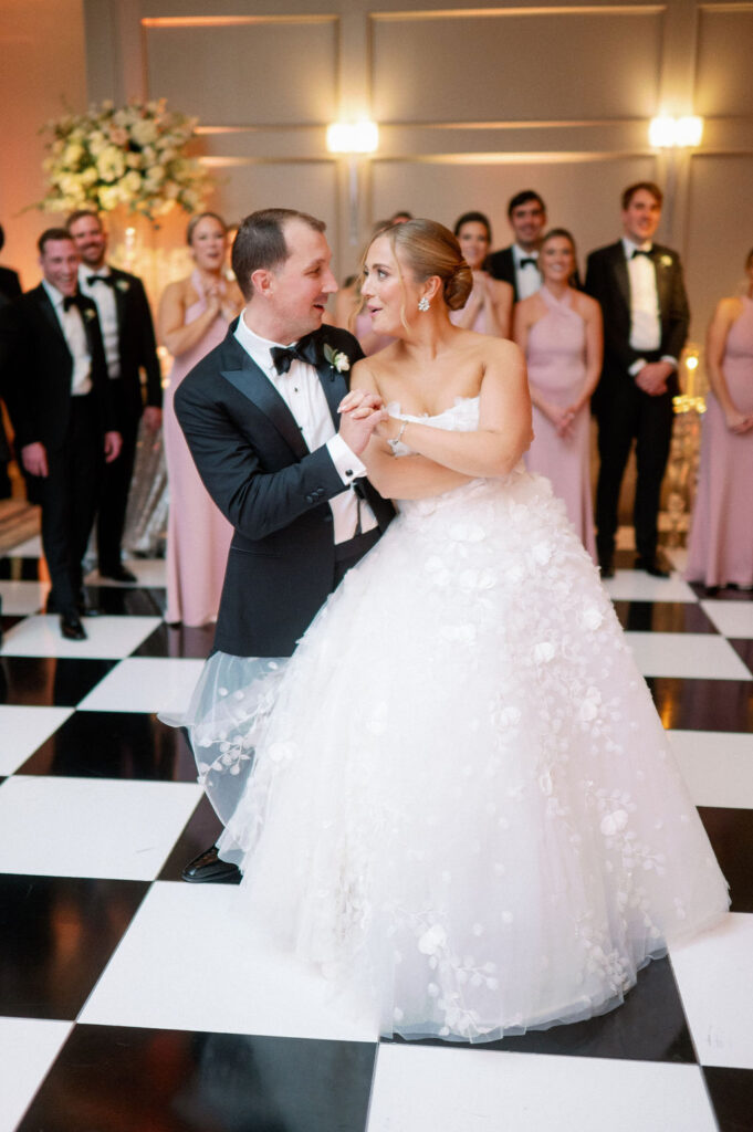
If you know you have a big music and dancing crowd, focus your guests attention on the entertainment! A swanky dance floor rental, lighting to highlight the dance floor and band/DJ, an upgraded DJ booth rental, or florals to frame the stage. All ideas to help dress up the space when you’ve invested in incredible entertainment for the night!
Highlight The Food & Drink
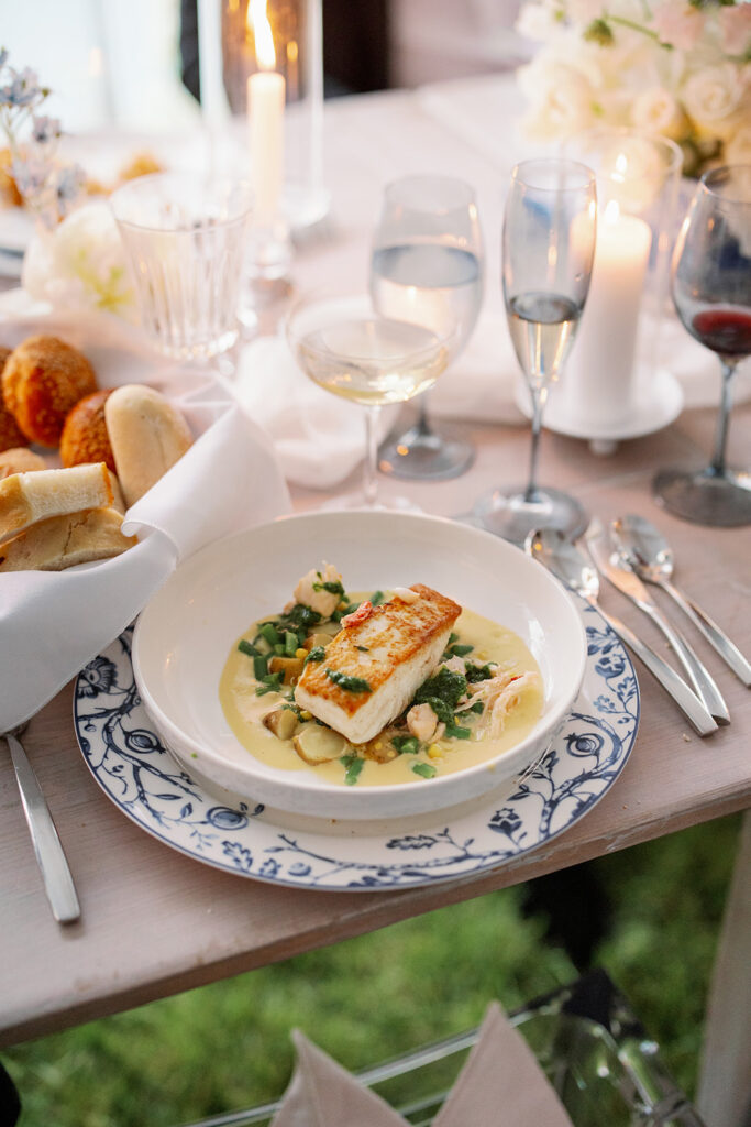
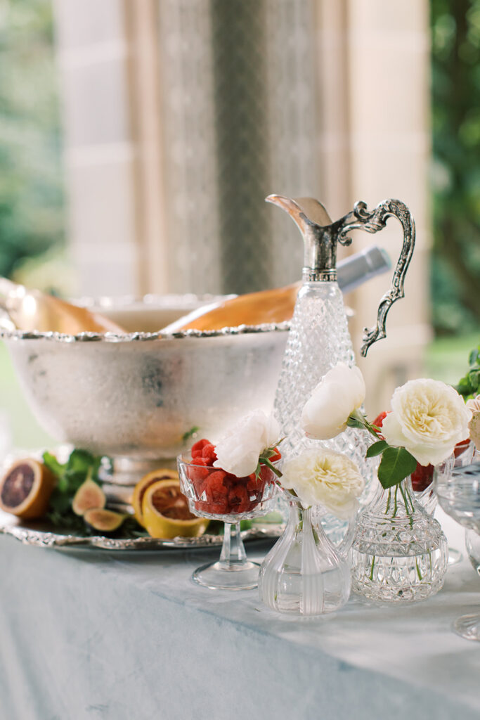
If the culinary experience is a high priority item for you, whether it’s at food stations or a plated dinner, add some design dollars to highlight this. Creative and thoughtfully planned rentals and florals can help you highlight your food stations, plated meal, bars, dessert station, late night snacks, and more.
Work With What You’ve Got!
Don’t try to work against the existing features and design inspiration that your venue already has. Embrace the quirks of your venue and highlight it’s natural features. Be open to new ideas that might work best with the space and use your venue to your advantage when it comes to design. Be curious about your venue’s potential and look for opportunities to showcase that gorgeous staircase, jaw-dropping fireplace, incredible view, brick accent walls, pops of color, etc.
When Choosing Design Pieces…
I follow a few rules of thumb when designing (and in life):
The Rule of Three
Three is the best number. I believe in the power of three for just about everything in life, and it just so happens it’s also a solid design tip. When designing, ordering, and arranging – work in threes and you’ll find a nice balance in numbers in the physical space.
Contrast
Too much of a good thing can be a bad thing. To achieve balance in your design, make sure you’re finding some opportunities to use some contrasting elements to create intrigue and draw attention. Matte and shine, light and dark, vibrant and muted, woods and metals. And if you LOVE muted tones, or metallics, or saturation… that’s OK! You can still have plenty of the thing you love while finding moments of contrast. The contrast is just going to make those elements you love stand out that much more. Do a gut check to ensure you’re not drowning in excess of any one thing.
Less is More
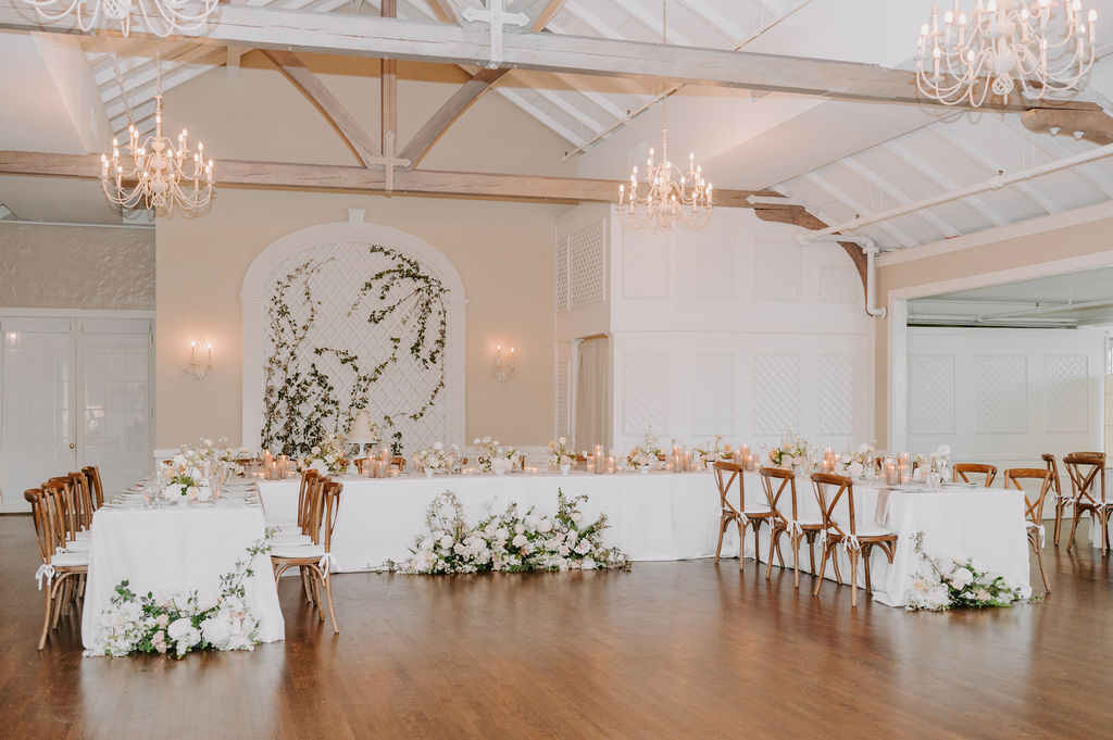
Others may disagree, but I 100% subscribe to the “less is more” mantra. Especially when you want to impress and indulge, it’s SO easy to go down the rabbit hole of wanting more and more. Volume and excess are not the key to making a statement and lasting impression. It’s OK to adopt a little bit of a minimalist P.O.V. for some aspects of your wedding design. Don’t crowd and fill the table or room because you’re afraid of a little blank space. Remember, understated beauty can be powerful!
The Little Details Do Matter…
Bathrooms
Us ladies spend a good chunk of time in and out of restrooms. Candlelight, a nice amenities basket (think: spray deoderant, floss, tide to go pen, bobby pins, safety pins, chapstick, mints, gum), upgraded hand towels, flowers, hand lotions and fun scents… all of these little amenities go a long way for the guest experience at a relatively low cost.
Welcome Your Guests
For out of town guests, the hotel welcome bag does not need to be an elaborate thing. Thoughtful, local foods and beverages that reflect the area you’re in are always a nice touch. Include an itinerary for the weekend with all logistical info. At the wedding itself, signage and enough staff to greet and help answer guest questions is always appreciated. Your guests are craving information and like to feel informed. Give them the info. they’re craving!
Personalize It
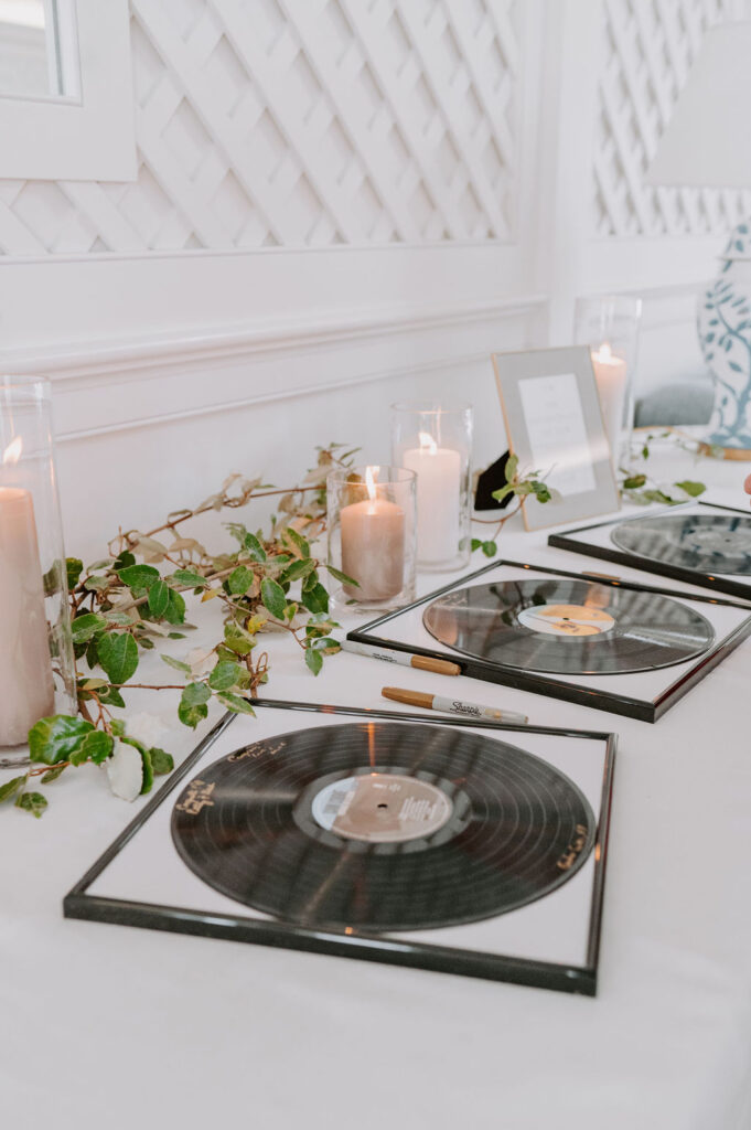
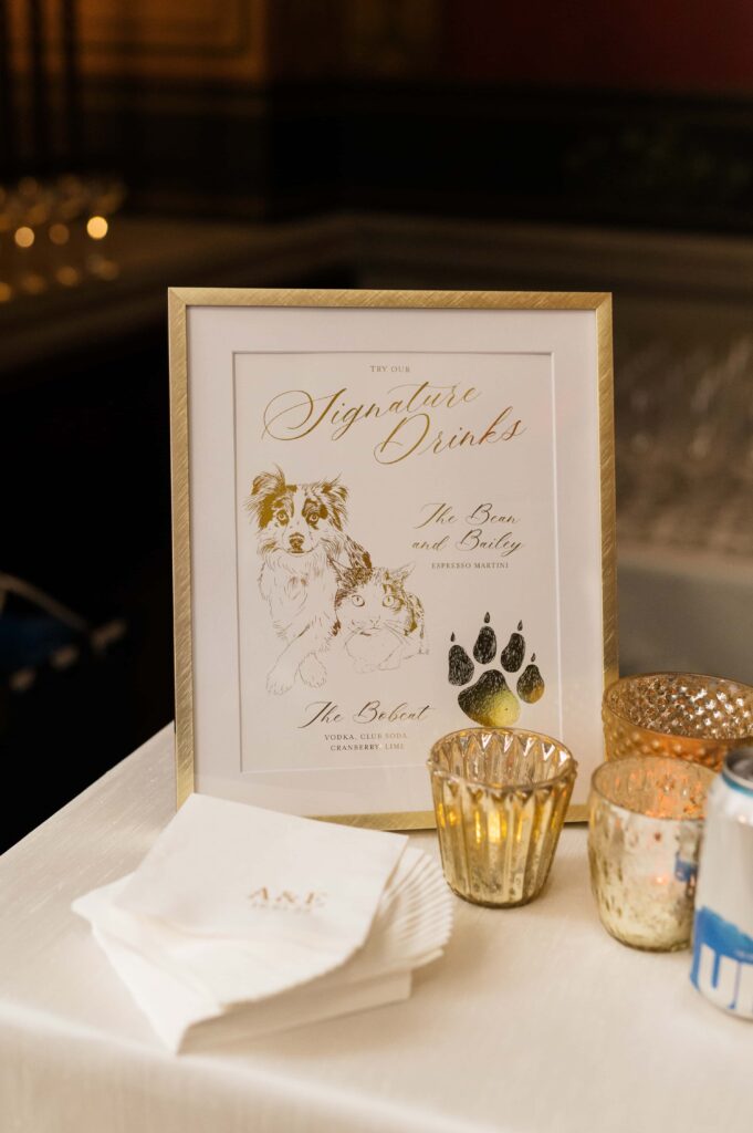
There are so many little moments at a wedding where you have the opportunity to personalize and make it yours. Printing a quote or hash tag on your cocktail napkins, creating themed tables instead of table numbers (at a Chicago wedding, each table was named after a famous Chicagoan, like Kanye and Obama). Welcome signs, escort cards or displays, menu cards, guest favors, and more. Don’t skip an opportunity to make every element, no matter how small, a celebration of you. Don’t take the easy way out of shrugging it off as “not important enough” or “too small a detail”. A bunch of thoughtful, small details can add up to one cohesive, memorable experience, even if it’s not so obvious to your guests right away.
A Note About DIY Design
If you’re thinking about going heavy on the DIY projects – don’t underestimate how much time will go into sourcing products, assembling, and transporting. Think through the entire project before you commit. Aim to take on a couple of small DIYs that are relatively easy and fun for you. Recruit help. Don’t try to be super woman and DIY an entire wedding on your own. Trust me, it is not worth the time and stress, and depending on the project, sometimes the cost savings aren’t that enormous.
AND THERE YOU HAVE IT! At the end of the day – design is deeply personal and your wedding design should be a reflection of your style, not just a collection of beautiful, material things. That’s why our design process with our clients typically takes months to perfect. Do some reflection and talk to your partner about how you want your wedding to feel, and build off of that. Allow your professional vendors to get creative and stay open to new ideas. And if these design tips don’t resonate with you, that’s OK! Everyone has their own perspective and aesthetic, which is why it’s SO important to find vendors that vibe with your unique personality and vision.
If you’re feeling stuck and uninspired with your wedding design, contact us for a free consultation. We offer services for all budgets – whether it’s consultation session or a tailored design package just for you.
Like This Post? Share It!